 |
| DIGIPAK 1 |
 |
| DIGIPAK 2 |
 |
| Complete Website |
 |
| Performance screenshot |
 |
| Performance screenshot |
 |
| performance screenshot |
 |
| Narrative screenshot |
 |
| narrative screenshot |
 |
| Narrative screenshot |
 |
| Conceptual screenshot |
 |
| conceptual screenshot |
 |
conceptual screenshot
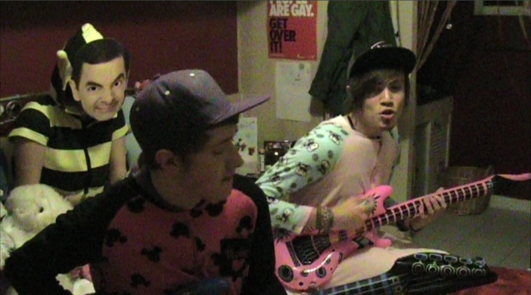
To maintain a clear image and theme throughout our campaign we have stuck to the conventions of a "punk rock' music video. We used many performance scenes, where the band were playing their instruments due to guitars/bass'/drums playing a large role in the music video. We used close ups and different shot angles so that the audience can get engrossed into the music video as well as being sort of 'included'. We used a short narrative to tie into the musics lyrics as well as bringing characters in it that are of the target audience age. Throughout our music video there are many conceptual scenes which show the band members doing crazy, silly things...in public. This conveys the 'care free' and 'live life to the fullest' nature of Blink-182's music videos.
We used wooden mannequins for the website and CD cover. These are associated with the band members in the video when they are acting silly. We also used a wooden hand in the conventual 'devil horn' hand sign which is associated with rock gigs. The Mannequins are splashed with vibrant pink/green paint splatters, this weaves in with the conventual pop punk colours and also personally with Blinks logo. By drawing cross eyes and smiles on the faces of the mannequins we linked the DIGIPAK with the original BLINK 182 logos.
|
 |
| Bowling for soup webpage |
 |
| Blink 182 webpage |
 |
| Blink 182 digipak |
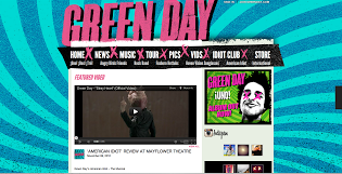 |
| Green day website |
 |
| green digipak |
They follow the conventions of what an audience expects from a pop punk music video. They use of vibrant colours and patterns make the websites interesting to look at and visually pleasing. They also have tour dates/social networking sites/videos and chances to create a membership on them, this allows the audience to get involved in the bands life and keep check on what theyre doing and if they are coming to tour near them. The digipaks follow the suit of the websites and show alot of the conventual 'pop punk' bright colours/cartoon styles.
There are many direct links between these digipaks/websites and that of our own, we have added a comical style to our digipaks by using the mannequines in a comical way and have them posing in silly positions. We have also used bright coloured paint splodges to make them visually pleasing and inteetsing to loos at. On the website we used contrasting between the mannequins and the black background to make them stand out.
The blink 182 digipak is extremely busy and has alot going on in it, this is the same has our digipak; we have stacked many images on top of eachother so that it is busy and not much blank space. The green day website has used cross's on their links to make it look interesting. Our website uses skateboards in the same way. Skateboards also fit in with the pop punk themese which is what audiences' expect.


No comments:
Post a Comment